Responsive Web Design
Responsive Web Design interfaces with mobile devices tablets & computers all these devices are used to surf the web in a growing astronomical pace, but unfortunately much of the web isn’t optimized for those mobile devices. Mobile devices are often constrained by display size and require a different approach to how content is laid out on the screen.
A multitude of different screen sizes exist across phones, “phablets,” tablets, desktops, game consoles, TVs, and even wearables. Screen sizes are always changing, so it’s important that your site can adapt to any screen size, today or in the future.
Responsive web design, originally defined by Ethan Marcotte in A List Apart, responds to the needs of the users and the devices they’re using. The layout changes based on the size and capabilities of the device. For example, on a phone users would see content shown in a single column view; a tablet might show the same content in two columns.
Responsive Web Design What’s the Difference?
So first up, what’s the key differences between responsive and adaptive design?
Put simply, responsive is fluid and adapts to the size of the screen no matter what the target device. Responsive uses CSS media queries to change styles based on the target device such as display type, width, height etc., and only one of these is necessary for the site to adapt to different screens.
Adaptive design, on the other hand, uses static layouts based on breakpoints which don’t respond once they’re initially loaded. Adaptive works to detect the screen size and load the appropriate layout for it – generally you would design an adaptive site for six common screen widths:
- 320
- 480
- 760
- 960
- 1200
- 1600.
On the surface, it appears that adaptive requires more work as you have to design layouts for a minimum of six widths. However, responsive can be more complex as improper use of media queries (or indeed not using them at all) can make for display and performance issues.
The latter in particular has created a lot of discussion over the past few years as it’s been the case that many sites deliver the full desktop model which, even if it’s not loading on the mobile device, slows sites down considerably. To get around this, you can use media queries–but there will be a few tradeoffs since a responsive site is never going to be as quick as a dedicated mobile site.
Responsive Web Design Why Use Adaptive?
Adaptive is useful for retrofitting an existing site in order to make it more mobile friendly. This allows you to take control of the design and develop for specific, multiple viewports. The number of viewports that you choose to design for is entirely up to you, your company and overall budget. It does, however, afford you a certain amount of control (for example over content and layout) that you won’t necessarily have using responsive design.
Generally, you would begin by designing for a low resolution viewport and work your way up to ensure that the design doesn’t become constrained by the content.
As mentioned previously, it’s standard to design for six resolutions. However, you can make a more informed decision by looking at your web analytics for the most commonly used devices and then designing for those viewports.
If you want to design an adaptive site from scratch, that’s OK too. Start again by designing for the lowest resolution and work your way up. You can then use media queries to expand the layout for higher resolution viewports. However, if you do design for multiple resolutions, you may find that this causes the layout to ‘jump’ when resizing a window.
It can be extra work designing and developing a site with adaptive for multiple viewports so it’s usually used for retrofitting.
We also offer the following
Web Design Services
Website Branding
Seo Services
Why Use Responsive?
The majority of new sites now use responsive, which has been made easier for less experienced designers and developers, thanks to the availability of themes accessible through CMS systems such as WordPress, Joomla and Drupal.
Responsive doesn’t offer as much control as adaptive, but takes much less work to both build and maintain. Responsive layouts are also fluid and whilst adaptive can and does use percentages to give a more fluid feel when scaling, these can again cause a jump when a window is resized. For example, in the image below, which shows a fluid layout, the designer is using percentage widths so that the view will be adjusted for each user.
With responsive you will be designing with all layouts in mind and this of course can confuse the process and make it quite complex. This means that you should focus on creating a viewport for mid-resolution and you can then use media queries to adjust for low and high resolutions later on.
So in essence, it’s usually better to use responsive for new projects, and adaptive for retrofits.
Considerations to Take into Account
As discussed earlier, responsive sites can suffer when it comes to site speed (if they aren’t properly implemented).
Responsive also requires more in the way of coding in order to ensure that the site fits each and every screen that access it. However, the extra work is debatable (compared to adaptive design) since adaptive design requires that you develop and maintain separate HTML and CSS code for each layout. Modifying adaptive sites is also more complex since it’s likely you’ll have to ensure that everything is still working sitewide (such as SEO, content and links) when it’s time for implementation.
You should, of course, also consider the user experience. Because responsive essentially shuffles the content around in order to fluidly fit the device window, you will need to pay particular attention to the visual hierarchy of the design as it shifts around.
Responsive design often turns into solving a puzzle — how to reorganize elements on larger pages to fit skinnier, longer pages or vice versa. However, ensuring that elements fit within a page is not enough. For a responsive design to be successful, the design must also be usable at all screen resolutions and sizes.”
So there’s no shortcuts to whichever technique you decide to use – both require the work that come with creating a site that’s essentially one-size-fits-all. Responsive has a slight edge, as you won’t, going forward, need to spend an awful lot of time in site maintenance.
Sample Websites Links
Tavern 23
Landscapes Unlimited
Drmp Concrete
Affordable Mattress
John Randles Restaurant
Dudens Tree Care
The Decision
When it comes down to it, the key is to consider your audience first and foremost no matter what design technique you adopt. Once you know exactly who they are and what devices they tend to access the site on, then it’s easier to design with them in mind when it comes to layout, content and so on.
It will also depend largely on whether you have an existing site to work with or you’re starting from scratch. Responsive design has become the go-to design technique and it’s thought that around 1/8 websites now use responsive (while there’s little to no data on how many use adaptive). Adoption rates for responsive are growing quickly too and have almost reached the same level as standalone mobile sites.
With all of that in mind, it’s safe to say that responsive is usually the preferred technique if only because of the ongoing work that adaptive design demands.
However, if a client or company has the budget, then adaptive might be a better choice, according to a test carried out by Catchpoint. They built two sites in WordPress, one using the standard WP TwentyFourteen responsive theme and the other using a plugin called Wiziapp.
The plugin serves a mobile theme to users depending on the device they’re accessing the site from and also offers advanced configuration options so that you can further streamline the process.
The results in load time speak for themselves:
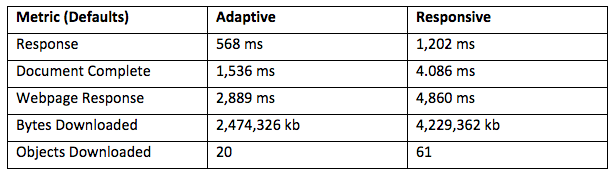
It should be pointed out that no optimization was carried out at all, but this does show that the responsive site is downloading everything that is required for desktop. So right out of the box, the theme doesn’t offer very good performance at all.
Again, this can be overcome using media queries, but the above serves as a good example of why responsive design – whilst being a popular choice – is not always the best for mobile. Until something better comes along though, it’s difficult to know what we can do about it other than learn how to properly code and implement a great responsive site.
So the conclusion?
Responsive design will remain popular, but that might be because we have not yet found a decent solution to the heavy maintenance that adaptive demands. Adaptive design hasn’t died out though, despite the web’s apparent love of responsive, so it’s possible – in theory at least – that we’ll see some improvements emerge yet that will blow responsive web design out of the water.
Multimedia Graphics will handle every aspect of your web design, we can help with content, photography, branding and SEO. And you will be surprised by just how affordable we are. Our complete web & design service is usually less than most companies charge. Call 612-312-1757 we will be glad to help!
Offering affordable Business Card Services & graphic design services throughout Minneapolis, St Paul, twin cities area, Rochester, Duluth, Bloomington, Brooklyn Park, Plymouth, Maple Grove, Woodbury, St. Cloud, Eden Prairie, Eagan, Coon Rapids,Blaine, Burnsville, Lakeville, Minnetonka, Apple Valley, Edina, St. Louis Park, Moorhead, Mankato, Maplewood, Shakopee, Richfield, Cottage Grove, Roseville, Inver Grove Heights, Andover, Brooklyn Center, Savage, Oakdale, Fridley, Winona, Shoreview, Ramsey, Chanhassen, Prior Lake, White Bear Lake, Chaska, Austin, Elk River,Champlin, Faribault, Rosemount, Crystal, Lino Lakes, Farmington, Hastings, New Brighton, Golden Valley, New Hope, South St. Paul, West St. Paul,Columbia Heights,Willmar, Northfield, Stillwater, Anoka,Hibbing, Otsego,Hugo, Brainerd, Monticello, Vadnais Heights, Rogers, Alexandria, Albertville, Princeton, Forest Lake, Stillwater, Lake Elmo,Oak Grove,Wayzata,Deephaven